Wednesday, 12 December 2012

FROST ON GRASSES


Only a few days to go now before the end of this module and preparation is in full swing.  I'm rushing around trying to pull the collections together.     The frost looks amazing this morning and I took a so I decided to take some photographs for my primary research file but by the time I'd got the camera out  the wintery sun had been obscured by the mist.   I took the photos anyone but I intend to go out during the Christmas break and record the landscape in the changeable weather.

Grasses with Frost
Grasses


While I was scanning some images in yesterday an art student mentioned a landscape artist Peter Doig he is a Turner Prize winner.


White Canoe by Peter Doig

I love the reflective nature  of the painting.

It reminded me that Lowry sometimes used to paint his canvases black then paint over with white.  I've painted up a piece of paper with black and when its dry intend to paint some grasses through white paint scratching out the surface.


Tuesday, 11 December 2012

From Chinoiseries to Perspex

I have been thinking for a long time now that it would be nice to work with perspex and textiles.  I would like to encase my designs so they are like specimens, delicate objects 'preserved in aspic' so to speak.  I want to create a clean almost industrial feel to the objects (with steel and bolt fixing - possibly with antique hinges) that could be wall hanging or free standing screens.   I love Chinese antique folding screens and chinoiseries.  They are beautiful precious pieces.

Chineoserie Folding Screens

Black Lacquered Chinese Folding Screens

Coromandel screen

Coco Chanel loved to collect Coromandel Screens which consist of wooden folded panels coated in black or dark lacquer usually carved sometimes decorated with jade, semi-precious stones, shell, or porcelain.  She owned over 32 Coromandel screens and in some rooms applied them to the walls like wallpaper.

I would like to create obviously a more contemporary feel with perspex.  But I would like to create free standing or wall hanging panels, which will encase my textile designs.   I discussed this with Tom today,  our computer tutor, who is also a furniture designer, as I thought he may know where I could purchase perspex.  He was very helpful and gave me some companies to try. 

It's been a good day today very productive I just hope I can keep going till next Monday.


CARAVAN! DECAYED BEAUTY

Composed Caravan Composite


Today I decided to re-examine my original primary photographic research to spark off some inspiration.   I remembered this photograph of a derelict caravan we came across in North Wales while on holiday. I love the weathered decay, the moss, algae and rust, its like the forest is reclaiming it.  I had another photograph of some birch trees (I think taken from some National Trust Garden we visited) and some photographs of the viaduct and woods near our home which were taken on a misty wintery day. 

I started playing around with the images on photoshop by taking the colour out of the pictures and changing the threshold levels then add touches of colour and played around with the satiation and opacity.   The caravan and the birch trees worked very well I felt they had a mystical quality and decided to crop and combine the two photographs together to create a new composition.  I then built around the caravan cutting and pasting more trees.    You can see all the fine detail of the branches creating, texture and a painterly effect.        

I have printed the photograph off onto watercolour paper so that I can stitch into and collage over the top I'm looking forward to this and if it is successful I may create a collection moody woody forms.


Original photographs


Landscape Textile Artists

The last couple of days I have been researching other textile designers to inform my work.  Because I am interested in landscape in particular I was very interested in the work of Chloe Holt.

Chloe Holt 

Chloe Holt is an award winning textile artist who is very interested in landscape, erosion, and surface texture.


Dionne Swift 


This is a devore textile piece by Dionne Swift.   I love the way she has traced the landscape with colour and line cutting away the fabric with devore.

I have been working on my Journal and Essay most of this week -  the deadline is on Wednesday - and in writing the conclusion (it is on  Grayson Perry, Outsider Art and it's influence on contemporary practise) I realised what I had enjoyed about the work of the various artists I discussed.   It is the use of mixed media.  I like to combine ideas from all different sources and 'mash' them together.  This is how I want to move forward with my work.   I have enjoyed the printing, working with photographs, painting and stitching and combining them together.

Grayson Perry for instance uses collage in his work and mixed media and is also not afraid to place his work on various surfaces, from tapestries to ceramics.


Grayson Perry and his tapestry Class


Wednesday, 5 December 2012

Vertical/Abstract Landscape

This collection of Vertical Landscapes has been evolving.   I have been using heavy, painterly effects on this and strong colour combined with some print.

Wheat Landscape


Here I've scratched back against a vibrant yellow acrylic.   I've done a few of these compositions and also gone back to an early abstract landscape I posted earlier of red rock and have played around with the image on photoshop.  I know this is a big weakness in my lack of skills with the computer which frustrates me because I know it can produce some amazing things.   I tend to shy away from using it and so have been forcing myself to use the elements of it that I feel confident with.

Vertical rocks and birds


Close up detail of birds which have been stitched into.


I need to work on these and try to paint some more of the larger scale paintings which inspired this painting.


Rocks, Reflections and Crags


Rocks, Reflections and Crags is a collection I have been developing using watercolour (wet on wet), bleeding colours together and also adding Brusho in powered form and liquid.   I painted the horizontal landscapes below first and added machine stitch to certain areas.


Horizontal Watercolour Landscapes

I decided to rip apart pieces of a landscape I wasn't happy with I with then stitched and collaged together an abstract reflective horizontal image which I quite like but  which needs more of a focal point   and detail.


Abstracted Reflections and Crags


For my Essay and Journal I have been studying Outsider Art and in particular Grayson Perry and Henry Dargar who both use collage in their work, in particular photographic images.  It occurred to me that it would be interesting to add my own photographs of landscape and detailed texture to these water colour images.   I may not have time to do this by the end of this sampling module but will pursue this next term.

I have also been researching painters and in particular those who work on cloth.  I particularly love Carole Waller.   She creates wearable art and wall pieces in site specific areas, often large scale and multilayered.


Carole Waller Clothes Collection


I love the vibrant colour and translucent nature of the the clothes.


From Sampling to Composition

Macro-Micro


Its been a couple of weeks since I last blogged because its been hectic, what with the essay to finish and the journal, but mainly more researching and experimenting with work so it seems there is loads to catch up on and discuss.

I have decided to split my work up into three collections:

                        .                           Macro-Micro  ( which I mentioned in an earlier blog)
                        .                           Rocks Reflections and Crags
                        .                           Abstract Landscape

These titles are fluid at the moment but it helps me to clarify in my own mind where I am going with each collection.

The Macro-Micro theme is developing an individual shape, style colour and mood.  I like the vertical narrow shapes and envisage enormous long panels of artwork that would be suited to loft-style living or large community areas.  I have been limiting myself to using blues and touches of pink and white to create an atmospheric almost stormy or threatening mood.  

I have been spending time experimenting with printing trying to develop the gum-arabic method (not easy) and also mono printing.  I loved the quality of the mono printing and used a thick pliable print paper that is easy to stitch into.  Below is one of the mono prints before I stitched into it.  I want to develop this technique to help me create the micro/abstract element of the vertical prints.  
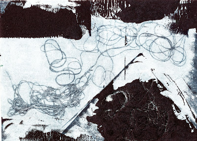
 Abstract Monoprint


 I experimented in the print room with devore fabrics and screen printing as below and now want to add these processes to the digitally printed mono print above on a devore fabric.  Here I have screen printed twice onto the same fabric once to burn away fabric secondly, to add a raised surface.  I want to work with this idea creating complicated  multi-layered designs.
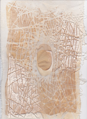
Devore sample

Composition and focal points are a stumbling block for me.  I get absorbed in texture  and shape so I have been trying to think more about the placement of my work more.

Landscape and Abstract Composition

Here I have combined four pieces of work (two mono prints and two gum arabic) then I have stitched them together.    There have been many failures over the last two weeks in print methods etc., but some of these have proved to be successes.   I hate starting on a plain piece of paper and a friend of mine said that the Shakers always put a mark on whatever they make because they believe only God can achieve perfection.  I quite like that idea and by ripping up these failures and stitching them together it has proved a less scary prospect than starting on a fresh canvas.

Friday, 9 November 2012

Macro v Micro

This has been a very busy week.  I have been working on the printing process I have discussed earlier using the gum arabic transfer method.   But the method is difficult to achieve I have had variable results.  The detailed pictures I had hoped for have not worked.  I have emailed a teacher who taught me the method to see where I am going wrong then I will try again next week.  The results have not been a waste of time because I like the atmospheric texture of the pieces and have been collaging and stitching into them.  The above picture is a collaged experiment.  I like the idea of creating micro and macro landscapes.   Here I have shown a landscape with a textural piece below it.  I've added stitch to various sections.


This is a compilation of various images I collaged together.  I  then tried the printing method which did not work clearly so used the painted over images to stitch into when dry to add texture.  You can't see the stitch on these pictures.  The colour way was very dark blues so I scanned them in and altered the brightness and colour adjustments which gave more definition to the birds and other detail.  I need to experiment more.   The landscape theme is proving to be very interesting.  I feel there is plenty of scope for me to take it further.


Thursday, 1 November 2012

Abstract Landscape


It has been half term last week so we took the children away to Ambleside, Lake District and I combined taking photographs of the landscape, and visiting art galleries with the holiday.  It was amazing because the trees had turned various shades of red and orange.  I was interested in the light on the landscape, colour and texture and feel that the atmosphere of the outside is captured more by abstract landscape than realistic.  By that I mean it captures what you are feeling the beauty and essence of nature.   On my return I came across these abstract landscapes by Anne Stahl who lives in San Luis Obispo USA I feel she creates the essence of the landscape.  These paintings are views from bogs.

Bog by Anne Stahl
Winter Oil on Canvas by Anne Stahl
During my visit we visited various galleries and came across one selling large fabric panels.  This is what I have been thinking of creating myself but I want to work on a large scale representative of the landscape.  

I have been working on another type of printing using gum arabic to transfer atmospheric images from photographs.

I was pleased with the atmosphere in this print


I also found the rough sheets I pressed against the images each time had a great abstract texture and collaged these together to create a great background to stitch into.


Wednesday, 17 October 2012

It's a Rollercoaster

These two photographs are of Hilbre Island


The above photographs were taken at Hilbre Island on the Wirrall and the painting below was inspired by them.  I had my tutorial yesterday and they were very interested in this abstract landscape.  They liked the free form nature of it which I was please about because I personally liked it and want to develop more in this style.  I was surprised because although I liked it, I was unsure whether it had enough content/detail.

landscape detail of rock


I scanned this image in using the "map enhancer" which gave me vibrant colour contrast then adjusted the tonal threshold to create the image below which might be interesting on a screen.


black and white version
I do feel that I'm on a roller coaster one minute I'm happy with what I'm doing the next it's a disaster or its not what I want to achieve.  Nick said during the tutorial that you have to go through pain to get where you want to be.    I know exactly what he means,  its like a marathon you just have to keep running through the pain!  And that means experiment and work till something clicks.  I hope it does!

TEXTURE * LINE * FORM

My theme for my final year is texture, line and form in the landscape and as I have posted previously I have been gathering Secondary research from all over.  Photographs of Ansel Adams, National Geographic showing large panaramic views and also interpretations of landscape such as the European Folk Art with their peasant landscapes which have a definite pattern and rhythm to them using flat large scale images.  But in my primary research my photographs of the English landscape I have taken close up images of lichen, bark, stone etc., which are beautiful in themselves.


Photograph of algae on rock
water colour and inks


I love the subtle colours and beauty of lichen.  I can see the shapes recreated in stitch marks and raised textures.


I've been experimenting with brusho, celephane and salt to help me create the intense colour and lines.

Sunday, 7 October 2012

Great Northern Contemporary Craft Fair

Visited the Great Northern Contemporary Craft Fair this week.  Looking for inspiration and loved the new work of Louise Gardiner,  she has developed her own techniques mixing media and drawing with thread.  These designs create movement and explosive, organic designs.

Louise Gardiner

I loved the work of Claire Baker a ceramic artist.  She produces these highly glazed ceramics with transfers and paintings.     Many of the stalls were the same as last year.
Image 1 of 30
Add caption
Image 2 of 30Image 3 of 30
Image 30 of 30


Tuesday, 2 October 2012

'Crochetdermy' Wild Creatures

Another evening researching and I came across Shauna Richardson's amazing crochet creatures.  According to Katherine Higgins of the Antiques Roadshow her work is one to start collecting.  Made of mohair they are tactile, lifelike and amusing.

Makes you think about knitting and crochet in a different way!


Stag by Shauna Richardson www.shaunarichardson.com

Running Hare by Shauna Richardson www.shaunarichardson.com

Tent London

Couldn't get down to London for the Tent London exhibition, but found this amazing knitted furniture on-line that is exhibiting.  I'm obsessed with form and texture at the moment and just love these organic shapes.

They are designed by Claire-Anne O'Brien, a young Irish born London based designer and recent graduate from the RCA (MA Textiles).  Her big influence is pattern and form combined with research on traditional crafts and materials.

These pieces were inspired by elements of knitted stitch which she has exaggerated to a large scale.  I love them!


This lead me to these amazing felt cushions by  Anne Kyyro Quinn.


Anne Kyyrö Quinn: Pillows

Anne Kyyrö Quinn: Pillows

Anne Kyyrö Quinn: Pillows

Anne Kyyrö Quinn: Pillows

Anne Kyyrö Quinn: Pillows


Saturday, 22 September 2012

Modern Primitives


I have just come across this book "Modern Primitives" and found these amazing paintings by Ivan Generalic, who was one of a group of artists described as The Peasant Naives.  They painted the countryside they lived and worked in.


In a funny way they remind me of the Ansel Adam photography in its abstraction and love of nature.


IVAN GENERALIC