Just found these amazing mini feather jackets by artist Jane Edden on Designboom. She has created a series of miniature jackets fabricated from plumage that investigate our attitudes towards nature and the intention behind our consumption of natural materials, each sculpture is assembled from hundreds of tiny feathers. Her work is being shown at the Flowers Gallery in London from the 26th January, 2013.
I am an artist based at Neo:artist Studios in Bolton. I have a strong interest nature and urban landscape, and the patterns created by our interventions and manipulation of nature and man.
Monday, 28 January 2013
FEATHER JACKETS
Just found these amazing mini feather jackets by artist Jane Edden on Designboom. She has created a series of miniature jackets fabricated from plumage that investigate our attitudes towards nature and the intention behind our consumption of natural materials, each sculpture is assembled from hundreds of tiny feathers. Her work is being shown at the Flowers Gallery in London from the 26th January, 2013.
FROM POLE TO POLE
Had my review with Donna this morning to discuss how the last module went and how I intend to take my work forward in this final module. I discussed how I want to continue with the same theme but expand on it. I want to take more photographs of manmade objects in the landscape like the pole above but also old mills, towers. In my area there are quite a few quirky buildings like Peel Tower, Darwin Tower and remnants of Victorian Industrial Mills. I am interested in how they work in the landscape and how nature grows around them, suffocating them as though they are claiming them back to the earth. They can have a beauty of their own.
Sunday, 27 January 2013
LET THERE BE LIGHT!
![]() |
| Pizza Express Ceiling Light boxes |
Visited Pizza Express this afternoon and noticed these large boxed (possibly perspex) light boxes with abstract shapes. I want to use clear perspex to contain my designs but this has given me an idea for a collection of light fittings with my mixed media designs for large shades of some description.
Saturday, 26 January 2013
BIRDS EYE VIEW
![]() |
| For these birds I have added pen line to suggest stitch marks |
At the start of a module I find it is easy to get overwhelmed with the amount of work to do and I have a tendency to let that scare me and avoid starting. Ironically once I do start to paint or stitch I get inspiration from the techniques, failures and successes!
So I know I need to start with something to get me going. I've been thinking of including a bird somewhere in each design not necessarily obvious but hidden somewhere so I have been painting birds. I've added the heavy pen detail because it allows me to see where the stitch detail could go.
Thursday, 24 January 2013
SNOW RESEARCH
| Poles |
| Dusting of Ice from road by Rivington |
| SNOW MARKS
I've been out taking photographs near my home and am fascinated by the lines created by nature and by man in the snow. Here you can see the lines scratched out by cars (the tyre marks) and by foot. I love the beautiful shapes of the brown grasses against the white.
Above is a photograph of a telephone or electric pole faded by age. In the snow it had a certain faded beauty. I am thinking of looking at man-made objects in the countryside such as this. There are a couple of old mill towers near us which I intend to photograph ready to draw or paint.
|
Wednesday, 23 January 2013
CREATIVE IDENTITY
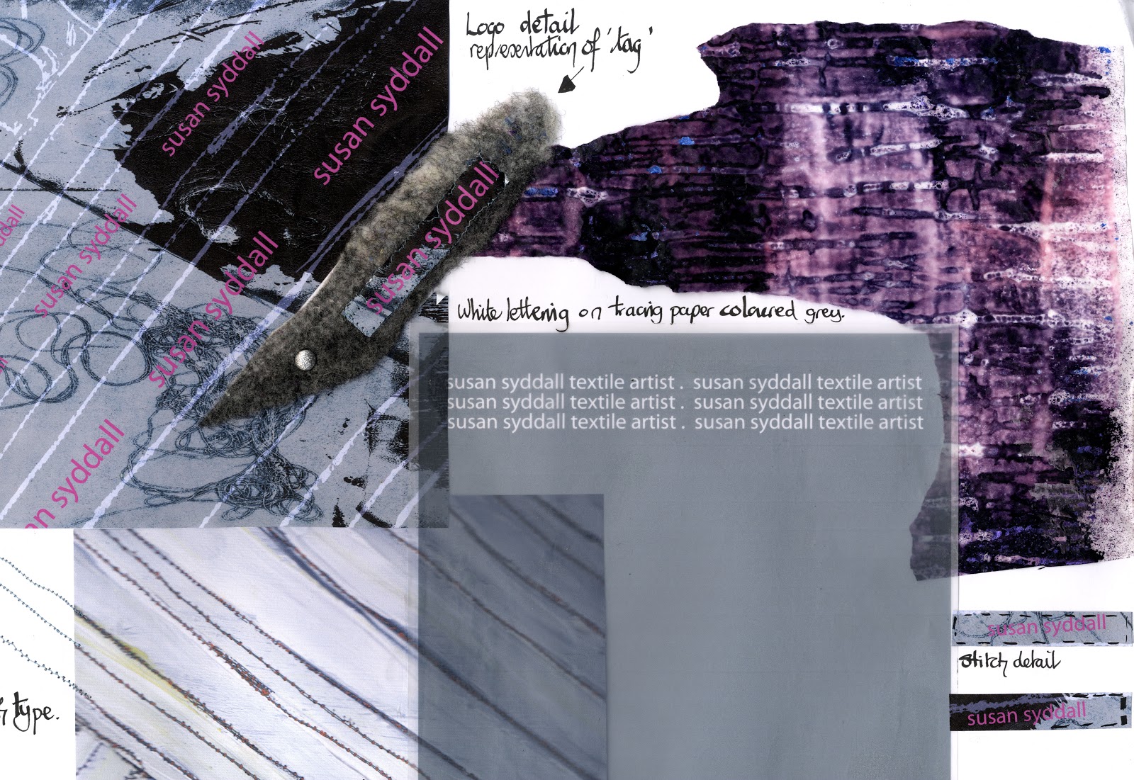
Tom launched the module last week for Professional Practice and Promotion and discussed in detail the importance of our own 'Creative Identity' and how our portfolio and press pack, logo etc., should convey the essence of what we represent as designers. This is an area I feel I need to pin down. Last year the press pack I produced did not reflect the correct image or professionalism required to take with me when we finish and of course for the final show and New Designers.
It is very interesting and not a simple task to convey what you are as a 'brand'. I have been scouring through graphic books and magazines pulling out images that I like. I want my business cards to imply texture, line and mood. I want to appeal to the craft and art market and have a tactile and artistic style.
Welcome 2013!
![]() |
| Electric light box by Troika |
| T |
| T |
It's exciting to think that we will be there in June as NEW DESIGNERS but very scary!
Subscribe to:
Posts (Atom)